Financial Case Study
Size: 12,000 sqft
Sector: Financial
Location: Bouverie Street, London
Apppointment: Lead Designer for Design & Build Company
Post Covid Leyton’s primary objective was to consolidate their 1st & 5th floors and get staff back onto 1 floor plate. Their building had two empty suites adjacent to their existing first floor, however these are separated by the building’s core, which meant no visual connection between the 3 spaces.
Our challenge was to strategies how best to use the space to enhance their staffs experience within the office. With their desire not to isolate staff across different areas of the floor plate the 2 additional spaces were seen as destination points with the working floor to the centre of the space.
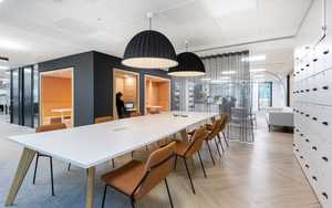
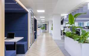
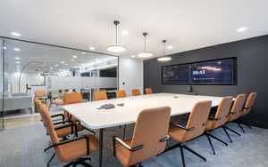
Suite 1 was designed as a destination meeting space with reconfigured existing meeting rooms - The reception desk doubles up as a touch down and collaboration space making the space work harder. Acoustic booths were designed to line the walkways, helping to provide acoustic benefit to the space.
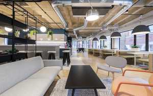
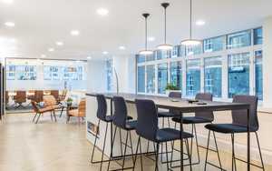
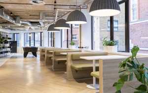
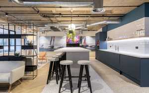
Suite 2 was designed as a destination breakout space - Dining & lounge areas follow the perimeter windows while a large central island sits in front of the teapoint. New exposed services and acoustic lighting were used to transform the space and to create a different feel.
The space needed to reflect their brand without being overwhelming. So a limited palette of materials was chosen to help bring unity to the space. A vinyl timber floor was used as a visual connection that helped link the 3 areas. A new lighting scheme throughout helped breathe new life into the floor by providing a mixture of ambient, direct and indirect lighting. While multiple acoustic solutions we implemented to help balance the space and reduce transference of sound.

